
The short answer
Open the website your guests will use, on your own phone, and complete the visit without relying on what you already know about the venue. Find the menu. Try the main booking, ordering, or enquiry action. Call. Get directions. Read the key information. Notice the first place you pause.
Mobile accessibility is part of that experience. W3C guidance covers small screens, touchscreens, different ways of entering information, and use in settings such as bright sunlight. WCAG offers a shared technical standard for improving access, but a short owner check is not a compliance audit. Local legal duties vary, so seek appropriate local advice when legal compliance is in scope.
If you are still deciding what belongs in the project, first read what a restaurant website quote should include. Then make these mobile checks part of the agreed launch review.
1. Start with the phone, not the desktop preview
Open the real test link on a phone. Do not judge it only from a narrow browser window on a laptop. Try it on mobile data as well as Wi Fi, turn the brightness down, and stand near a window or outside. W3C notes that mobile use includes small screens, touch input, and changing settings such as bright sunlight.
Choose the action that matters most. It may be booking a table, ordering food, checking availability, or starting a stay enquiry. Tap it from the homepage and continue until the final confirmation step. You do not need to submit a real order or booking, but you should see where the path leads and whether the venue, date, location, and next action remain clear.
Then tap the phone number and open directions. Confirm that both use the right details and location. You are looking for hesitation, not a perfect design score.
2. Make every important action easy to tap and read
Tap every navigation link, menu button, booking link, phone number, map link, and close button. Check that nearby controls do not cause accidental taps. WCAG 2.2 includes a minimum target size criterion of 24 by 24 CSS pixels, with specific exceptions. If an important control is smaller, tightly packed, or hard to reach, ask the developer to review that criterion rather than guessing.
Read each important page without pinching or turning the phone sideways. Text needs enough size, spacing, and line length to remain comfortable in a narrow viewport. Links and buttons should look interactive, and focus styles should remain visible for guests who navigate with a keyboard or another input method.
Look for horizontal scrolling. Some content, such as a map or a table that needs a two dimensional layout, may need special handling. For ordinary text and controls, a sideways drag is a useful warning that the layout is not adapting well.
3. Make the menu readable, not merely available
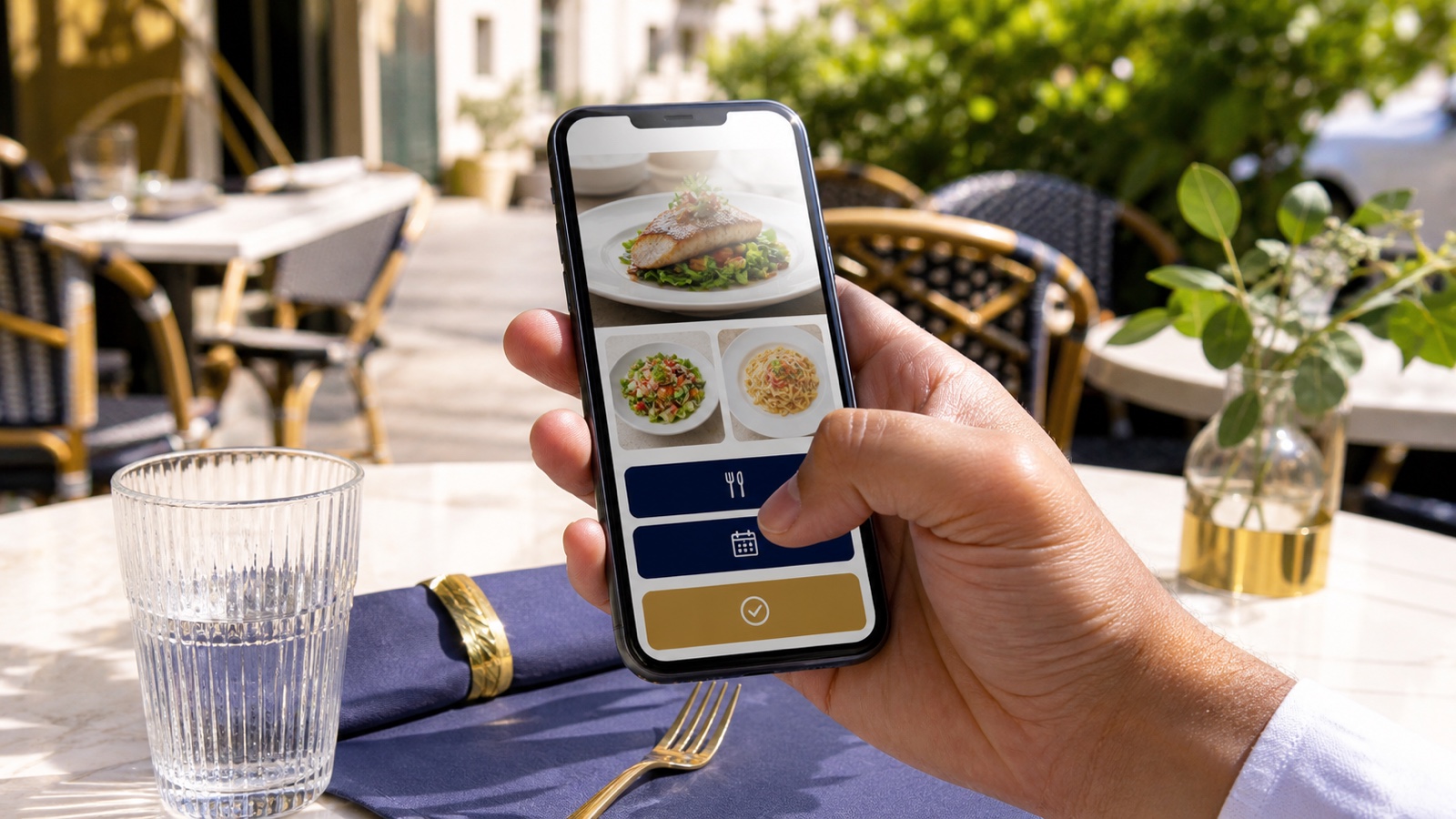
Start on the homepage, as a new guest might. Can you find the current food, drinks, rooms, or stay information without guessing which icon to tap? Check dish names, descriptions, prices, dietary notes, package details, and opening times. If you need to pinch, drag sideways, or hunt for the close control, the mobile version still needs work.
Pay special attention when menu items, offers, opening details, or contact information appear inside an image. W3C guidance calls for text alternatives for non text content. In practical terms, a guest who cannot use the image should still be able to get the important information. Keep essential details available as meaningful text, not only as words baked into a graphic.
4. Label forms and actions in plain language
Test every booking, contact, newsletter, and stay enquiry form. Each field should have a visible label that explains its purpose. W3C recommends associating the label with its form control in the code. This also makes the label a larger clickable area and helps assistive technology present the correct information.
Do not rely on placeholder text alone. It disappears when someone starts typing and can make it harder to check an answer. Use a clear label such as “Email address” or “Preferred date,” then name the final action precisely. “Request a table” or “Send room enquiry” tells a guest more than “Submit.” After sending, show a clear confirmation or a useful error message.
5. Respect motion, contrast, and more than color
Read text over every photograph, video, and colored panel. W3C guidance calls for sufficient contrast between foreground and background, including text on images and buttons. WCAG 2.2 sets a minimum contrast ratio of 4.5 to 1 for most normal text, with exceptions. A contrast checker can flag likely problems, but also inspect the page on the actual phone.
Color should not carry meaning by itself. If an unavailable date is shown only in pale red, add text or another clear cue. If a carousel, animation, background video, or sound starts automatically, provide a visible control that lets the guest stop it. Also check the site with reduced motion enabled on the phone and confirm that no essential content disappears.
6. Check what the mobile page actually contains
Google says it uses the mobile version of a site’s content for indexing and ranking. Compare the phone and desktop versions of each important page. The mobile page should retain the primary text, meaningful headings, images, image descriptions, titles, and captions. The layout can change, but hiding essential information from the mobile version can also hide it from Google’s view of the page.
Do not require a swipe, click, or typed action before primary content can load. Google also recommends looking at page experience as a whole, including mobile display, secure delivery, intrusive interruptions, and whether the main content is easy to distinguish. There is no single page experience signal, and a good test score does not guarantee a top search position.
7. Run the seven minute owner test
Set a timer, start on the homepage, and do one task each minute. Do not ask a team member to explain the site while you test it.
- Minute one: Identify the venue, location, and what a guest can do next.
- Minute two: Find the current menu, room information, or main offer. Check that it is readable without sideways dragging.
- Minute three: Try the main booking, ordering, availability, or enquiry path. Continue until the final confirmation step.
- Minute four: Tap the phone number, then open directions. Confirm that both use the right details and location.
- Minute five: Complete one form and deliberately leave one required field empty. Check the labels and error message.
- Minute six: Check contrast, then turn on reduced motion and inspect every moving section.
- Minute seven: Write down the first place you hesitated, what you expected, and the one change that would make the next step clearer.
Start with that first hesitation. Automated tools can help identify issues, but hands on use catches context that a score cannot understand.
Want a simple structure for your first pass?
The free Restaurant Website Quick Score walks through nine guest essentials and turns what you notice into three practical priorities.
Try the free Restaurant Website Quick ScoreWant a detailed check before launch?
The US$35 Website Check reviews your live or test site and gives you a short, practical priority list for mobile clarity, menu or stay information, booking, and search visibility.
See the Website CheckSources
- W3C, Web Content Accessibility Guidelines 2.2
- W3C Web Accessibility Initiative, mobile accessibility
- W3C Web Accessibility Initiative, designing for web accessibility
- W3C Web Accessibility Initiative, labeling form controls
- Google Search Central, mobile first indexing best practices
- Google Search Central, page experience guidance