
The short answer
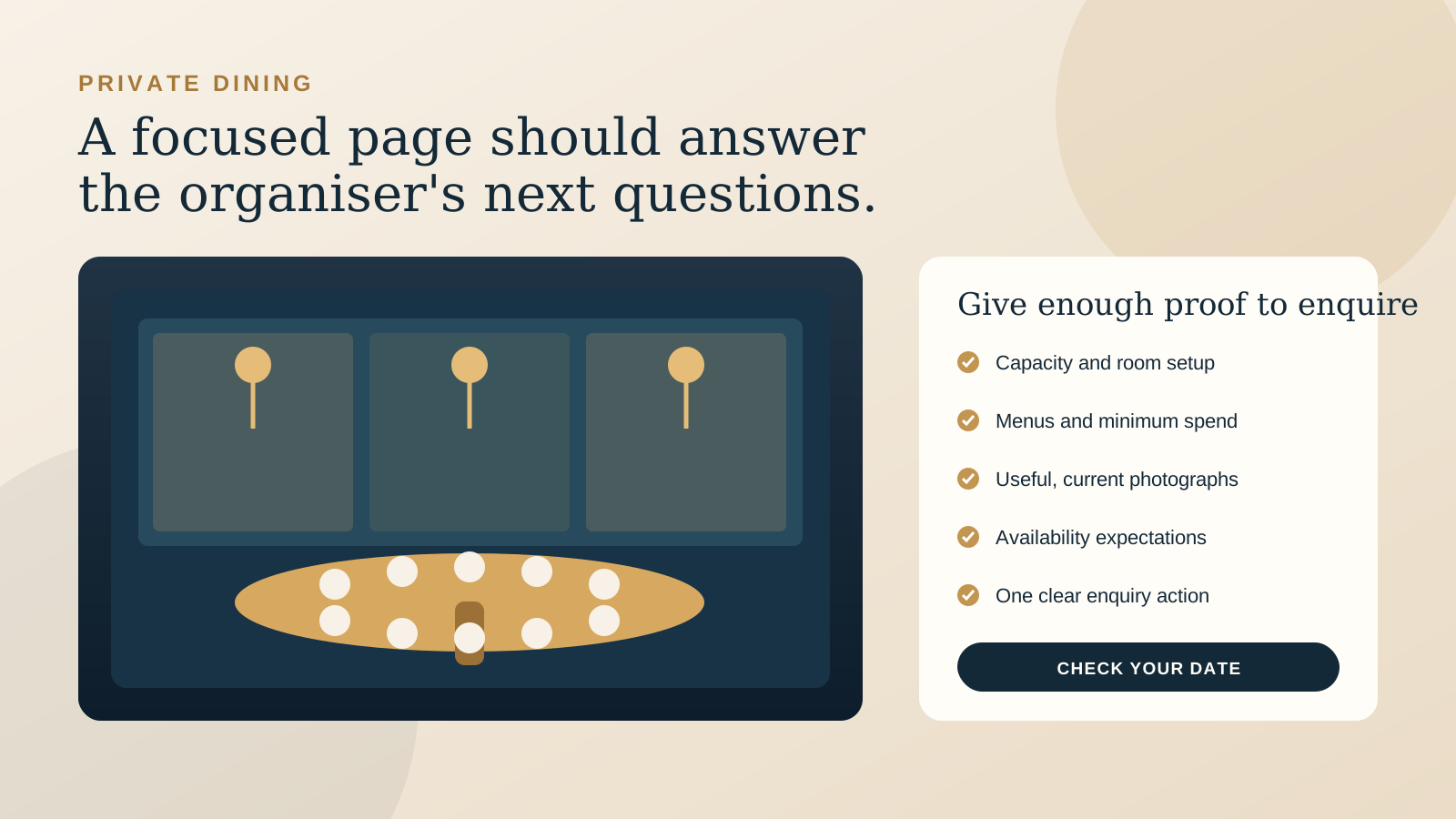
Create a dedicated private dining page when the offer has enough detail to support a separate decision. That usually means a distinct room or area, several event formats, group menus, capacity limits, minimum spend information, or an enquiry process that is different from an ordinary table booking.
Use a compact section when the offer is simple and the details are short. A restaurant with one shared table for groups, one set menu, and one contact method may only need a clear section on the home or booking page. It should still be possible to link directly to that section and understand the offer without searching.
The goal is not to add another page for its own sake. It is to help an organiser answer three questions: Is this place suitable for my event? Can it work for my date and group? What should I do next?
Choose a page or a compact section
A focused page earns its place when the organiser needs context. A birthday dinner, team celebration, wedding meal, or product launch may involve different room layouts, menus, access needs, timing, and budgets. Trying to fit all of that into a small home page block can produce vague copy and a contact button that asks the guest to start from zero.
A dedicated page is likely to be useful when you can answer several of these questions:
- Is there a private room, semi private area, terrace, or full venue option?
- Do capacities change for seated and standing events?
- Are there group menus, drinks packages, minimum spends, or venue fees?
- Do organisers need to compare photographs, layouts, or access details?
- Does the enquiry require more information than a normal restaurant booking?
- Would a guest want to send this information to another decision maker?
A compact section is enough when most answers fit into a few honest sentences. Name the group size, what makes the arrangement different from a normal booking, what is included, and how to enquire. Give the section a clear heading and a stable anchor link, such as /book/#groups, so staff can share it directly.
If you are planning the wider site, our guide to one page or multiple page restaurant websites shows how to separate tasks without making the navigation feel busy.
Show what the organiser needs to decide
Start with the details your events person repeats in early emails. If the same answer is sent every week, it probably belongs on the page. Clear information does not replace a conversation. It makes the first conversation more useful.
- Spaces and privacy: Name each room or area and explain whether it is fully private, partly screened, or part of the main dining room.
- Capacity: Give the practical range for seated and standing events where both apply. Note any setup that changes the number.
- Menus: Link current group menus or describe how menu selection works. State whether dietary needs can be discussed.
- Cost structure: Explain whether the event uses a minimum spend, room fee, set menu, or another arrangement. If pricing varies, say what affects it.
- Timing: Mention available service periods, usual event duration, and any important arrival or finish constraints.
- Access and facilities: Include relevant accessibility, bathroom, parking, audio, presentation, or weather information.
Keep these details current. If minimum spends or menus change by day or season, say so and identify the variables. Avoid a downloadable package with no date or owner. An old document can create more friction than a short, accurate page.
Use photographs and floor plans as proof
Private dining photography has a specific job. It should help an organiser understand the room, scale, atmosphere, and relationship to the rest of the venue. A close photograph of a beautiful plate cannot show whether twelve guests can hear each other or whether a presentation screen fits.
Include a small, deliberate set:
- One wide view that shows the whole space.
- One view for each layout you regularly offer.
- One detail that communicates the finish and atmosphere.
- One honest view of the entrance, terrace, outlook, or shared boundary when it affects the experience.
A simple labelled floor plan can help when the room has several setups, pillars, split levels, or a separate entrance. It does not need decorative detail. Show tables, doors, fixed features, and the orientation that helps someone understand the room. Make sure the plan remains readable on a phone and provide a text explanation for guests who cannot use the image.
Build a form that starts a useful conversation
The form should collect enough detail for the team to respond well, without asking the organiser to complete a full event brief before they know whether the venue is available. Start with the information that changes your first answer.
- Name and email address.
- Phone number, optional unless a call is essential to your process.
- Preferred date and an alternative date.
- Approximate start time.
- Expected number of guests.
- Event type.
- Preferred space or package, when there is a real choice.
- One open field for dietary needs, accessibility, budget context, or other useful details.
Do not make the ordinary reservation form do this job. A reservation form may assume a specific date, time, and table size, while a private event enquiry often needs discussion. Label the action honestly as Enquire about private dining or Check your date, not Book now unless the event is genuinely confirmed at the end of that flow.
After submission, show a clear confirmation. Tell the organiser that the enquiry was received, when a reply is normally expected, and what to do if the event is urgent. Send the same details by email so they have a record.
Make the mobile path obvious
An organiser may open the page from search, a social profile, an email from a colleague, or a link sent by your staff. The mobile version should make the offer and next step clear without requiring a tour of the whole website.
Place the primary enquiry action near the opening explanation, then repeat it after the practical details. Keep the action label consistent. Make phone numbers, email addresses, menu links, and floor plan links easy to tap. Compress photographs carefully so the page remains comfortable to use on a mobile connection.
Test the form with a real phone. Check the date controls, keyboard types, validation messages, confirmation screen, and the email received by the restaurant. Our restaurant website mobile checklist covers the wider menu, booking, directions, and contact journey.
Name the person who owns the response
A clear page can generate better enquiries, but the website cannot decide who answers them. Choose a person or role that owns the inbox, knows the current conditions, and can move an enquiry to the next step. Decide who covers that role during leave and busy service periods.
Route the form to an address the team actually monitors. Avoid sending important enquiries only to one personal inbox. Add the venue name, preferred date, and group size to the notification subject when your form allows it. That makes new enquiries easier to recognise and triage.
Create a short response pattern for common outcomes: available, unavailable, more information needed, or a better room or date suggested. The reply should still sound personal, but the team should not have to reconstruct the process each time.
Measure the useful steps
Start with a small set of measures that connect the page to real event work:
- Visits to the private dining page or section.
- Taps on the primary enquiry action.
- Completed enquiry forms.
- Enquiries that contain enough information for a useful first reply.
- Time from enquiry to first human response.
- Enquiries that become site visits, proposals, deposits, or confirmed events.
Review the language guests use in their questions. Repeated uncertainty about capacity, pricing, menus, privacy, or access is a content signal. Improve the page, then check whether the next enquiries arrive with better information. Do not judge the page only by traffic. A smaller number of suitable enquiries can be more useful than many vague messages.
An owner checklist before publishing
- Choose a dedicated page when the offer needs distinct space, capacity, menu, price, proof, and enquiry information.
- Use a compact, directly linkable section when the offer is simple and the details stay short.
- Explain the type of privacy, realistic capacity, menus, cost structure, timing, and relevant facilities.
- Show wide room views and useful layouts, not only food and table details.
- Ask for the date, time, group size, event type, and the few details that shape your first answer.
- Use an enquiry label unless the guest is completing a real booking.
- Test the entire path and confirmation on a phone.
- Name the person responsible for the inbox and the expected response time.
- Review enquiries regularly and improve the information that guests still have to ask for.
If the page is part of a wider website project, read what a restaurant website quote should include. The free Restaurant Website Quick Score can also help you check the menu, booking, mobile, contact, and location basics around this new enquiry path.
Want a second pair of eyes?
The US$35 Website Check reviews your live website and gives you a short priority list. If private dining matters to the business, we can look at whether guests can understand the offer, see credible proof, and complete the next step comfortably on a phone.
See the Website Check