
Start with a practical first review
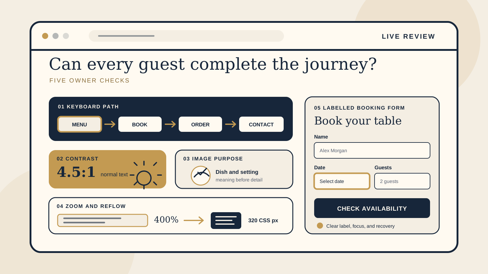
Accessibility is not one badge or one automated score. WCAG 2.2 is a detailed technical standard, and real accessibility also depends on the people, devices, browsers, and assistive technologies involved. The checks below are a useful first review. They are not legal advice, a claim of compliance, or a substitute for a specialist audit and testing with disabled users.
Begin with the pages that affect a visit or booking. Open the live site, not a design file, and choose one realistic task: read tonight's menu, reserve a table, place an order, ask about an allergy, or contact a boutique stay about a room. A page can look polished while one essential step is difficult or impossible to complete.
If you want a broader baseline before this review, the free Restaurant Website Quick Score checks nine guest essentials and gives you three priorities. Then use this checklist to look more closely at how different guests can operate and understand those paths.
Follow the whole keyboard path
Disconnect the mouse or simply stop touching it. Reload the home page and press Tab. A visible focus indicator should show which link, button, menu item, or field is active. Continue with Tab, move back with Shift and Tab, and use Enter or Space where appropriate. If a menu or calendar uses arrow keys, test those too.
Follow a complete restaurant journey in order: open the menu, reach the booking action, move through the booking fields, find online ordering, and reach the contact page or enquiry form. For a boutique stay, include room details and the availability or enquiry route. You should always know where focus is, and it should move in a sensible order that matches the page.
Watch for a navigation menu, pop-up, booking widget, or cookie notice that takes focus and will not let it leave. That is a keyboard trap. Also check that a sticky header or floating booking bar does not cover the focused control. W3C notes that native links, buttons, and form controls work with a keyboard by default, while custom controls may need additional work.
Third party booking and ordering steps belong in this test because guests experience them as part of the same task. If a handoff opens another site or window, make the change clear and confirm that the guest can still proceed and return. Our guides to a restaurant menu PDF or web page and a restaurant booking widget or link explain the wider choices around those two paths.
Check contrast in real conditions
Low contrast often appears in the details: pale gold text on cream, white type over a bright food photograph, faint form borders, or grey opening hours below a stronger heading. Check every state, including normal text, links, buttons, focus indicators, disabled dates, errors, and text placed over images.
WCAG 2.2 Level AA requires a contrast ratio of at least 4.5:1 for normal text and 3:1 for large text. These are measured values, so use a contrast checking tool for the final decision. Looking at the page is still valuable because it helps you find the places that deserve measurement.
Then try the site in the conditions your guests actually face. Check a phone near a sunny window or outside, lower the screen brightness, and look at a menu over a photograph. This sunlight review is a practical usability test, not proof that a colour pair meets WCAG. If important details become difficult to read, strengthen the contrast or place the text on a solid surface.
Describe an image by its purpose
Alternative text should serve the same purpose as the image, not inventory every visible object. Ask why the image is on this page. A photograph that shows the dining room's atmosphere may need a short description of the setting. A dish photo beside a menu item may need the dish name and one meaningful detail. A linked image needs text that explains where the link goes or what it does.
If nearby text already communicates the same information, avoid repeating a long caption. If an image is purely decorative, it usually needs an empty alt attribute so it can be skipped. If an image contains essential words, such as a photographed menu or event poster, place that information in readable page text as well.
W3C's image decision tree starts with purpose because different images need different treatments. Review food, rooms, maps, icons, awards, QR codes, and booking graphics one by one. File names and phrases such as “image of” rarely tell a guest what matters.
Resize text and test reflow
First increase text size or browser zoom to 200 percent. WCAG 2.2 requires text, apart from captions and images of text, to resize to 200 percent without loss of content or functionality. Read the menu, open navigation, use the booking action, and check that hours, prices, labels, and buttons are not clipped, overlapped, or hidden.
Next test a narrow viewport. The normative reflow requirement for vertically scrolling content is a width equivalent to 320 CSS pixels, without losing information or functionality and without requiring scrolling in two dimensions, except for content that genuinely needs a two dimensional layout for meaning or use. A common desktop review starts with a 1280px wide browser viewport and zooms to 400 percent, which is the equivalence noted by W3C. Browser chrome and scrollbars can make the actual content area slightly smaller, and this one setup does not represent every device.
Look for a menu table that runs off screen, a booking widget fixed to a wide frame, horizontal page scrolling, or controls that disappear behind a floating element. Content should reflow into a useful reading order. For more phone specific checks, use our restaurant website mobile UX checklist.
Make forms and actions understandable
Every booking, contact, private dining, and stay enquiry field needs a clear label that remains visible when someone starts typing. Placeholder text alone is not a reliable label. The visible label should also be associated with the form control in the code, commonly by matching the label's for attribute to the field's id. This gives browsers and assistive technology a dependable relationship.
Read links and buttons out of context. “View dinner menu,” “Book a table,” “Order pickup,” and “Ask about private dining” explain the result. Repeated labels such as “Click here” or “Learn more” make the next step harder to predict, especially when several appear together. The visible wording should agree with the control's accessible name.
Finally, make a deliberate mistake. Leave a required field empty, enter an invalid email address, or choose a booking time that is no longer available. The response should identify the problem in words, connect it to the relevant field, and suggest how to fix it when a known correction is available. Do not rely on a red outline alone. Preserve correctly entered information, move focus or attention to a useful error summary, and let the guest try again without restarting the whole task.
The owner checklist
- Complete the menu, booking, order, and contact paths with a keyboard only.
- Confirm that focus is always visible, follows a sensible order, and never becomes trapped or covered.
- Measure text contrast, including 4.5:1 for normal text and 3:1 for large text.
- Check key pages in bright real world conditions, especially text over photography.
- Review each meaningful image against its purpose and give decorative images empty alt text.
- Resize text to 200 percent and confirm that content and functions remain available.
- Test reflow at a width equivalent to 320 CSS pixels, using 400 percent zoom on a 1280px viewport as one common review.
- Keep form labels visible and ensure each one is associated with its field in the code.
- Use specific link and button wording, then test errors and recovery without losing correct entries.
Record the page, control, device, and exact problem for every issue you find. “Booking date cannot be reached with Tab” is more useful than “booking form is inaccessible.” Fix the barriers that stop a guest completing an essential task first, then arrange specialist review and user testing for a fuller picture.
Want a practical review of the guest journey?
The US$35 Website Check reviews your live mobile journey and gives you a short priority list for menus, booking, key venue details, and search basics. It is a focused website clarity review, not an accessibility compliance audit.
See the Website CheckSources
- W3C, Web Content Accessibility Guidelines 2.2
- W3C Web Accessibility Initiative, keyboard compatibility
- W3C Web Accessibility Initiative, colours with good contrast
- W3C Web Accessibility Initiative, image alternative text decision tree
- W3C Web Accessibility Initiative, understanding reflow
- W3C Web Accessibility Initiative, labelling form controls